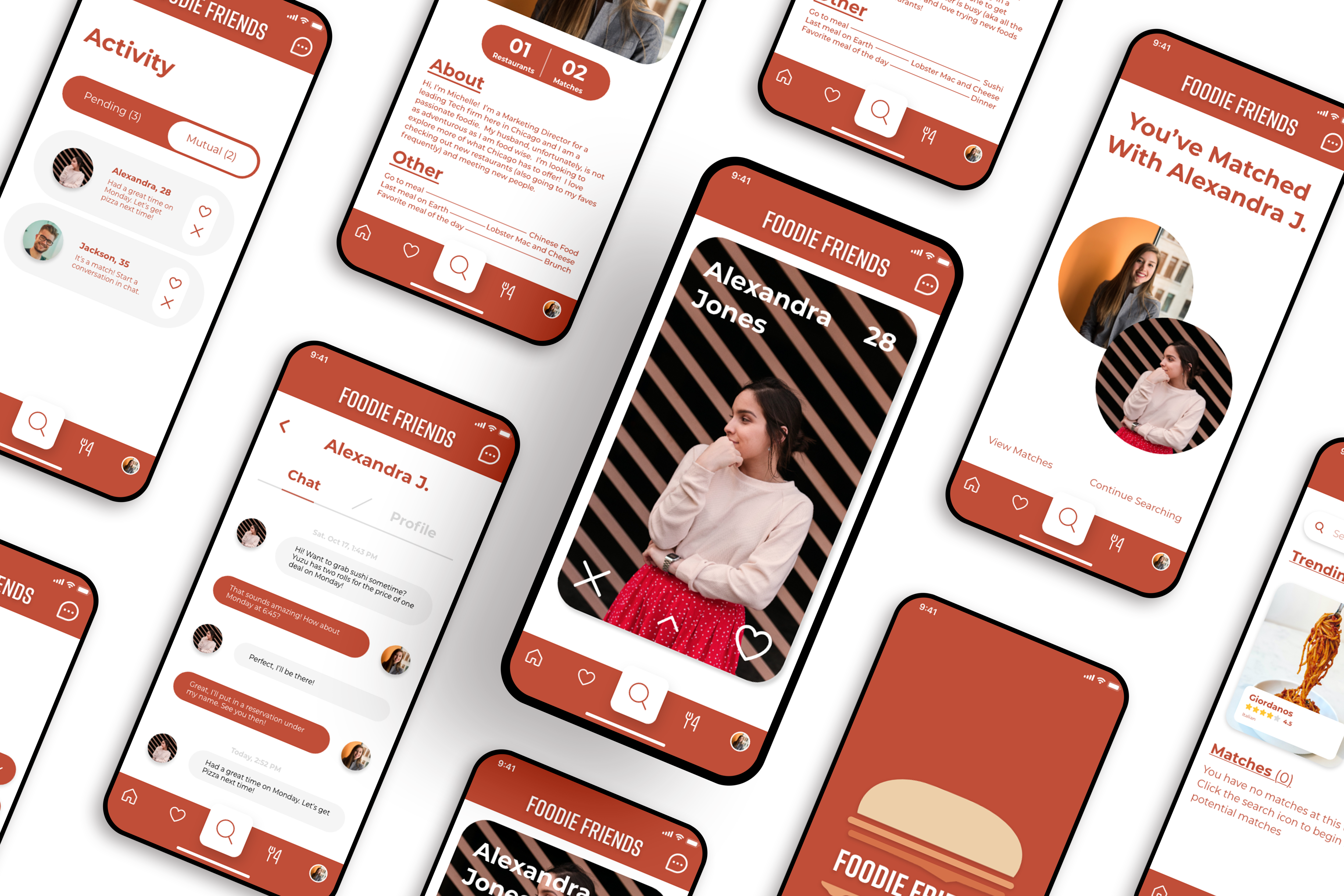

A meet up app focused on matching people with similar food and restaurant
preferences. App users select their food preferences, the gender they’re
interested in meeting, and their budgetary constraints, then we do the rest.
We have chosen to target foodies and food lovers alike who would love to
have the opportunity to try more restaurants
However what happens when schedules don’t align with your existing
friends or significant other or maybe you just don’t share similar tastes,
but you still really want to try that new restaurant. We know the
majority of people do not want to dine alone.
The problem we believe is that it becomes more challenging to meet new
people once you’re out of school and working full time.
Foodies need an easier way to try new foods and restaurants when
their peers can’t join them in the experience. Our solution is to connect
like-minded people based on food and restaurant preferences.
UX Research, UX Designer, UI Designer
Figma, Adobe XD, InVision, Miro, G Suite
October 2020
Focus on matching people based off of food interests and
restaurants they want to try. We seek to
use food to
form meaningful connections.
To create an app that connects people through food
or restaurant preferences.
People will want to use an app to make connections
with strangers over a meal.
Someone who enjoys food and trying new restaurants.
1. How do you currently make connections with
people?
2. Rate on a scale of 1 (not
important) to 5 (highly
important) the importance of food or beverage
when meeting new
people.
3. How do you discover/choose what foods or
restaurants you want to try or
eat?
4. Rate on a scale of 1 to 5 the value of budgeting
when determining where you want
to eat?
5. What factors are important in deciding a
restaurant to eat at? (Reviews,
budget, location,
size of restaurant etc).
Research will be collected through user interviews.
Based on our interviews, common themes we found were that
people have busy schedules but generally
enjoyed taking
time to eat out at least 1 - 2 times per week. When asked how
they meet new
people, interviewees shared that they either
meet people through friends of friends or activities
such as
yoga, but beyond that they were at a loss.
“People around you can make eating
more enjoyable.”
“I would be comfortable meeting
strangers if there was a feature that
would verify users based
off of
mutual connections.”
“I don’t like to eat out by myself; I
think it’s awkward to sit alone.”
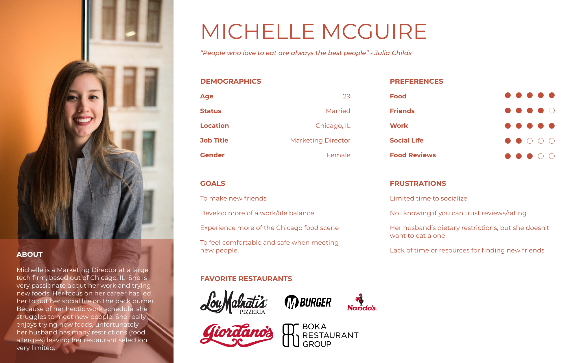
Meet Michelle. She is a busy young professional based in Chicago. She’s very focused on her
career and
neglected her social life. She’s married, but unfortunately her husband has a long list
of food
sensitivities and doesn’t share her love of trying new food. Michelle is looking to find
more of a
work/life balance, meet new friends and experience more of Chicago’s food scene.

Sign-in done via social
media. Empower individuals
to make the first move.

Provides images of the
food for each restaurant
as well as options to make
reservations or
get take
out. Generates revenue by
selling ads to restaurants.

Their app is very straight-
forward and easy to use.
Allows customers to find
open tables at
restaurants
and book them instantly
We believe that food is a common connection between all people. Foodies need
a way to easily try new
foods, discover new restaurants and form new relationships
How might we connect like-minded
people over the common interest of food?
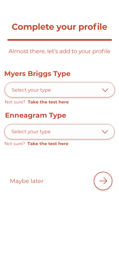
Based off of our User Insight and research, We began planning how we could solve these
problems with a
platonic meet up app called “Foodie Friends.” Our team brainstormed
ideas for possible features for the
app. For example, people may personality tests to help
match with strangers in a more unique way.
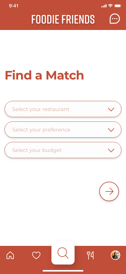
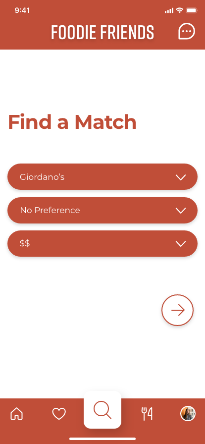
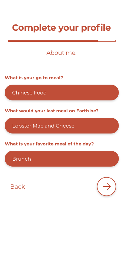
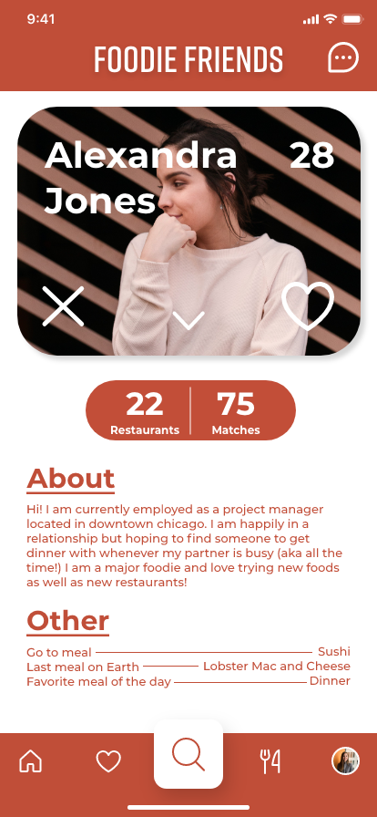
We thought to emphasize profiles with “About Me” information for people to increase
comfortability when
meeting up with strangers. We added the “About Me” questions as
well as number of matches and
restaurant preferences viewable on each profile.
Primary Header

Color Palette

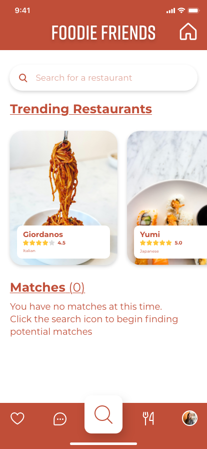

Rearranging the location of the navigation items was most important to many of our users.
We decided that
home should be the most important button putting it on the far left of the
bottom navigation bar. Our
homepage is most important because it emphasizes our food and
restaurant discounts/feature.
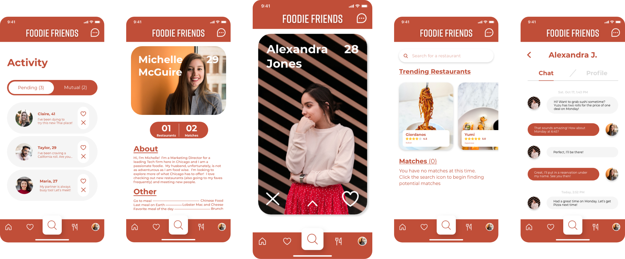
Our goal with this case study was to connect like-minded people over food interests,
which could be a
great way for food lovers to meet and form great relationships over
a meal. In the future we would like
to explore options such as, allowing users to match
and meet in groups, allow users to only search
candidates that work at the same business
or company, create a way to verify users authenticity to
create a safe environment, and
lastly explore a feature that would connect through Facebook to check to
see if users
have mutual connections with you (a friend of a friend).